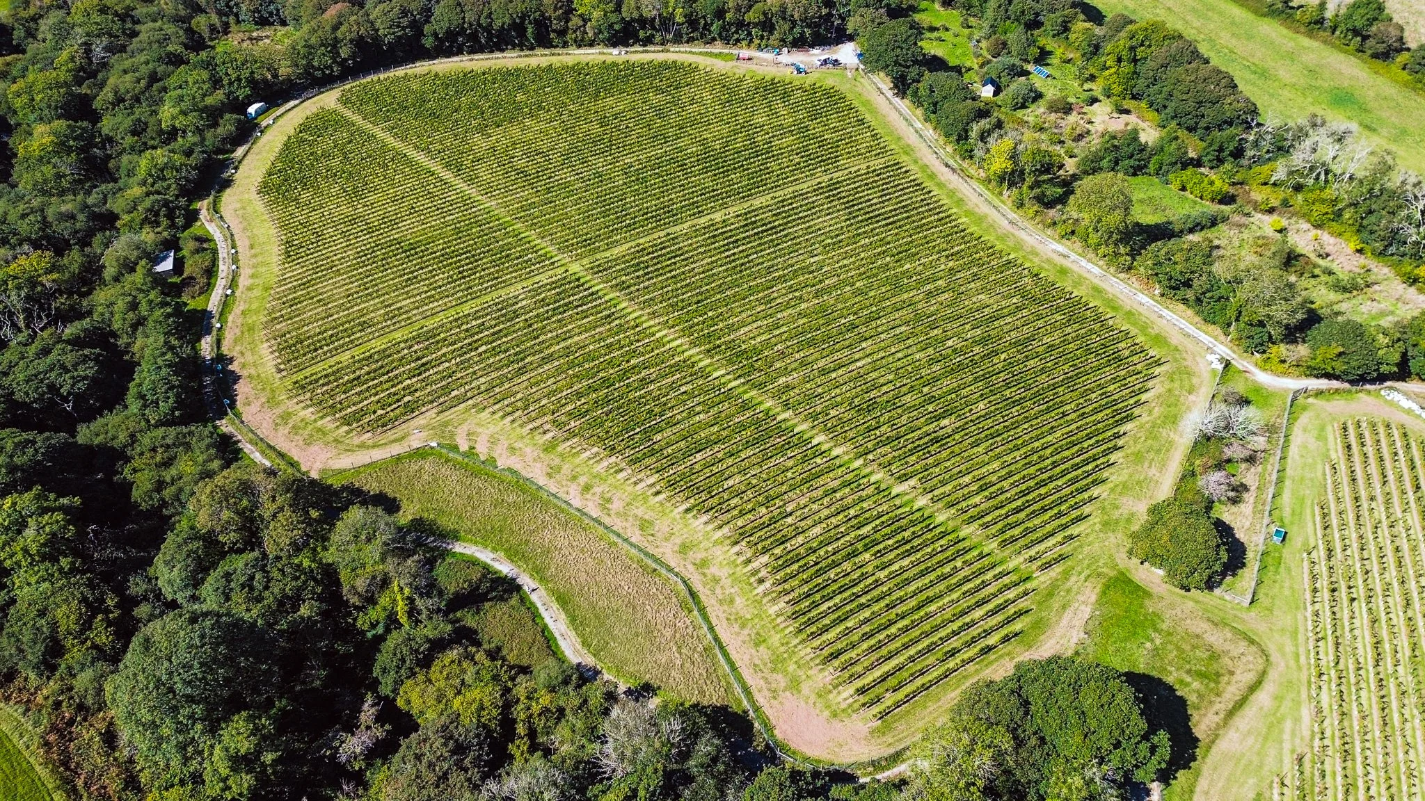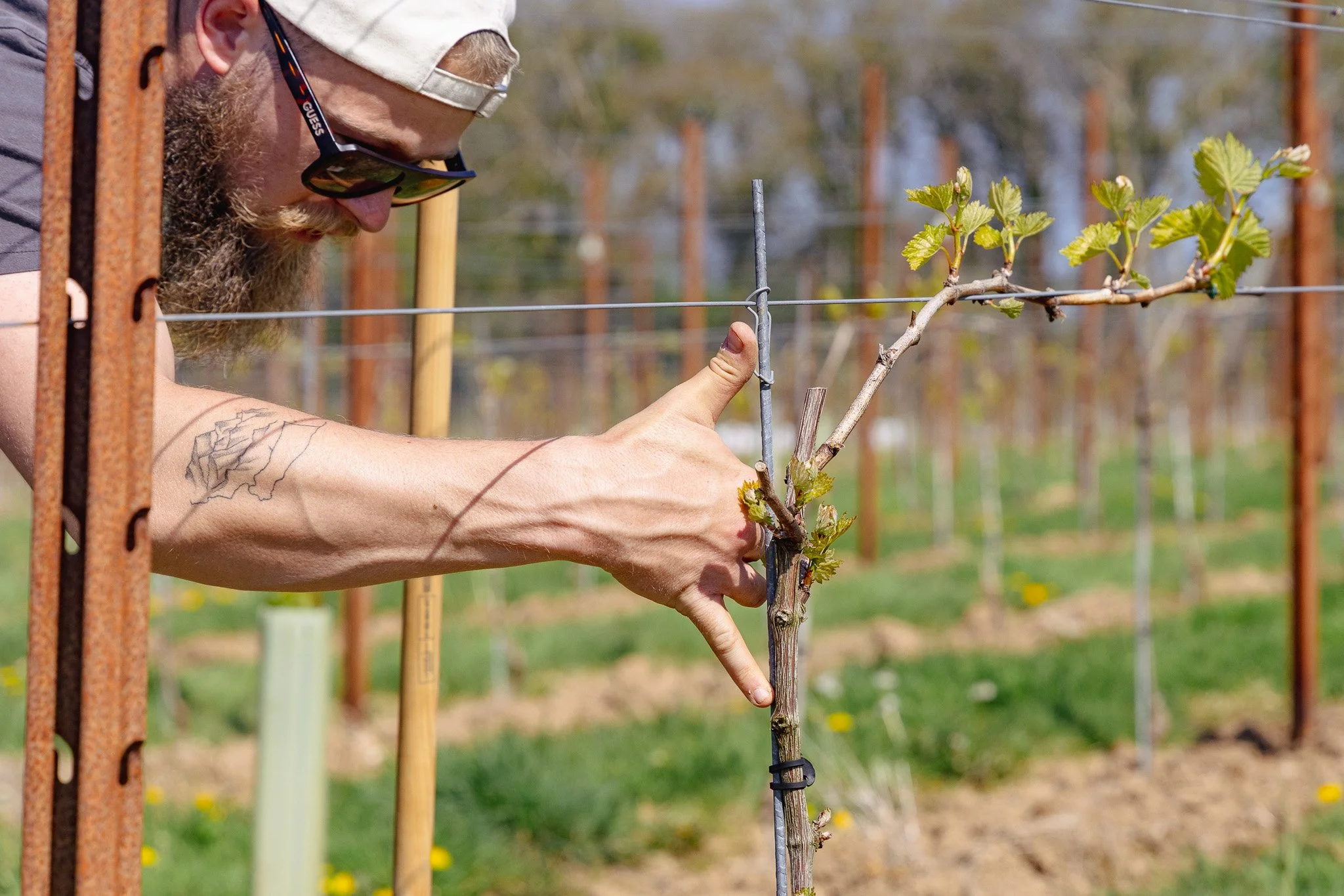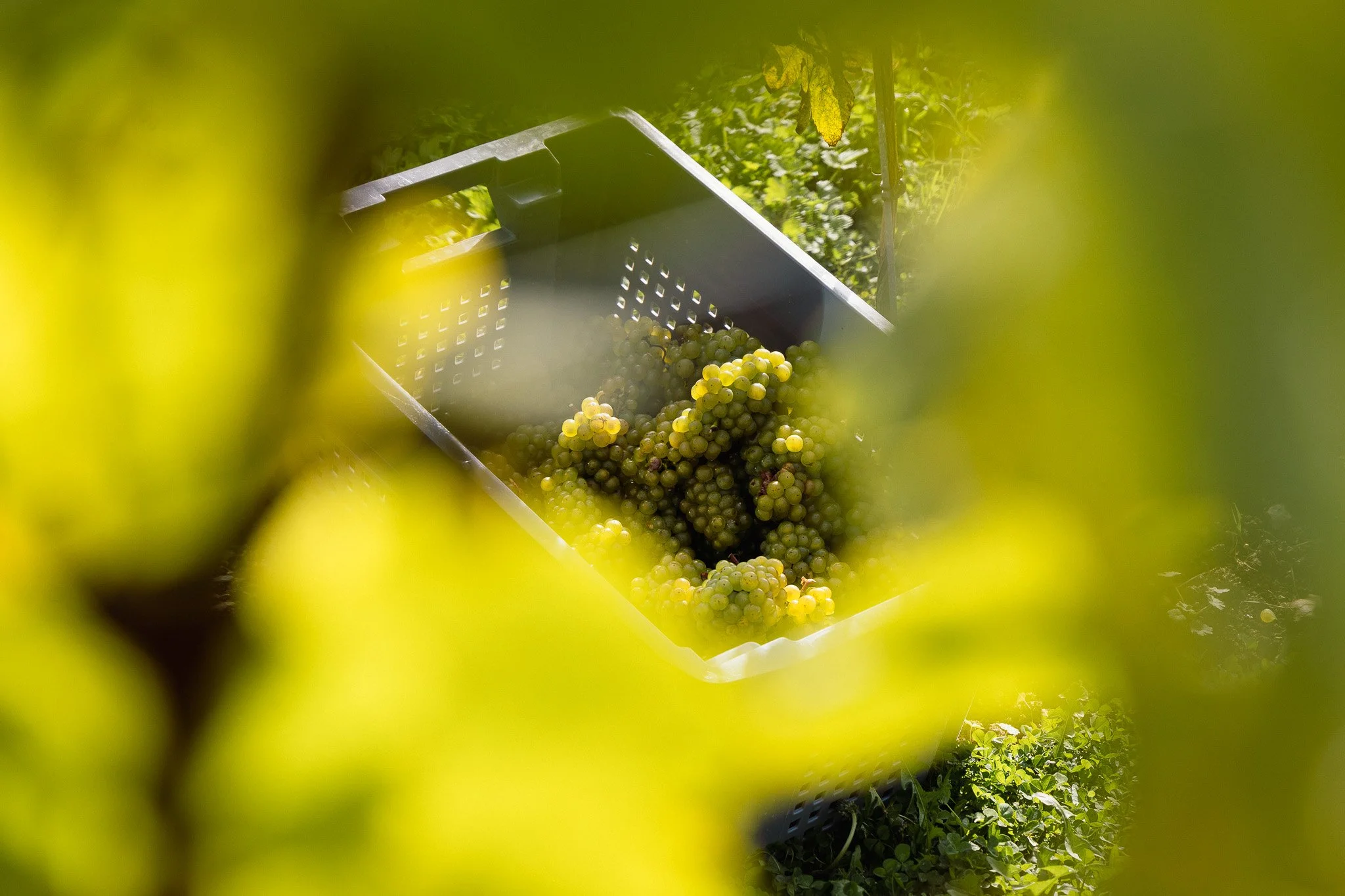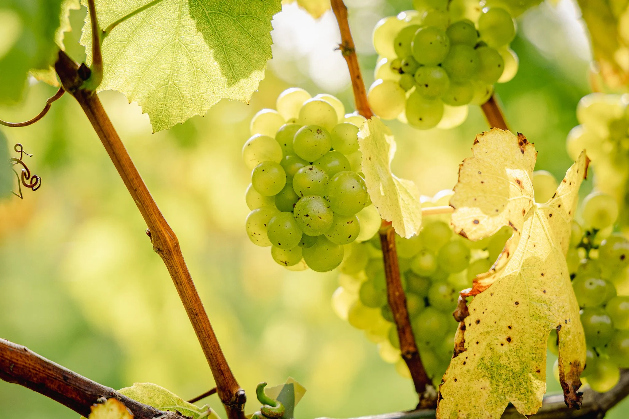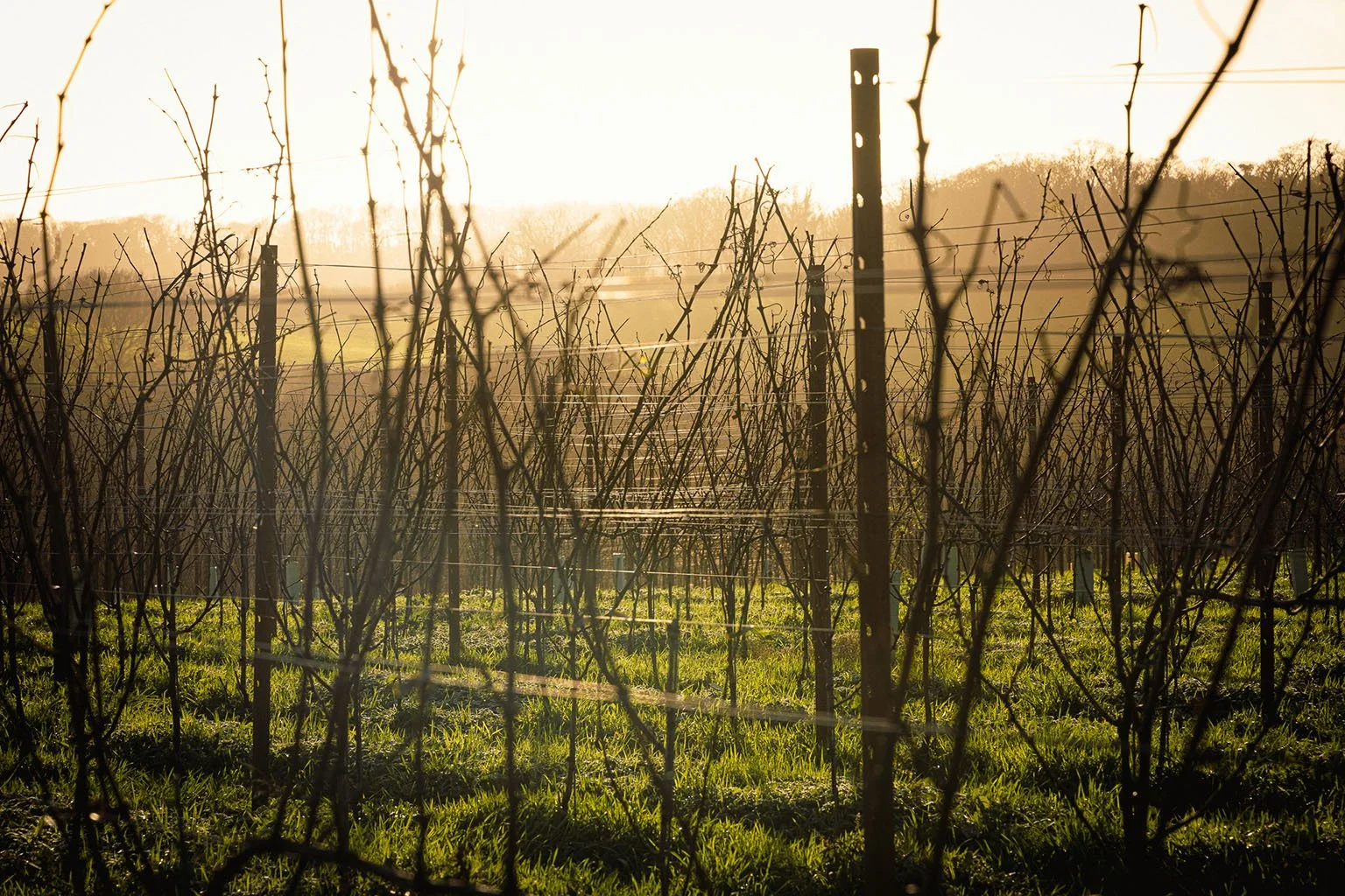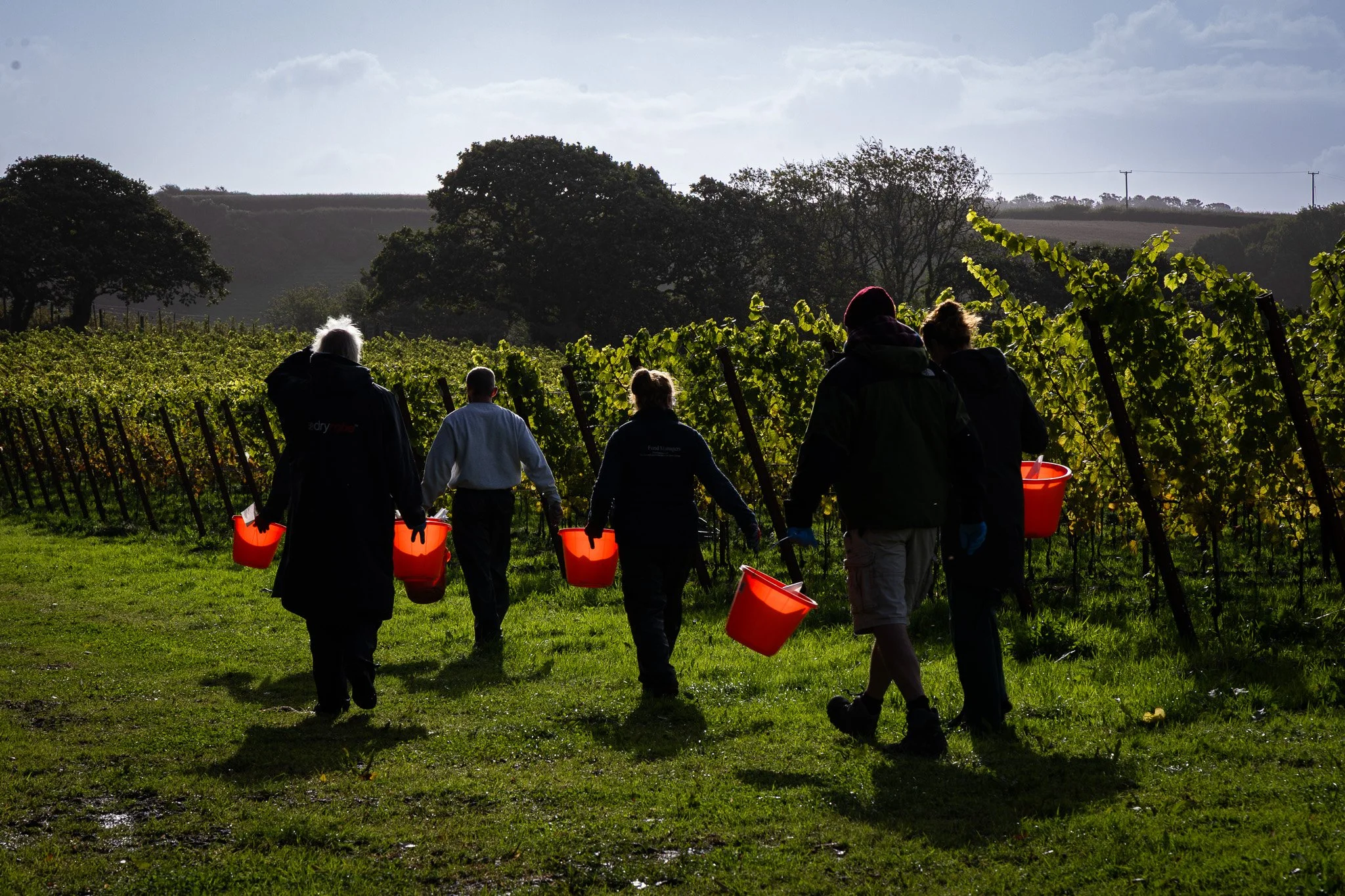
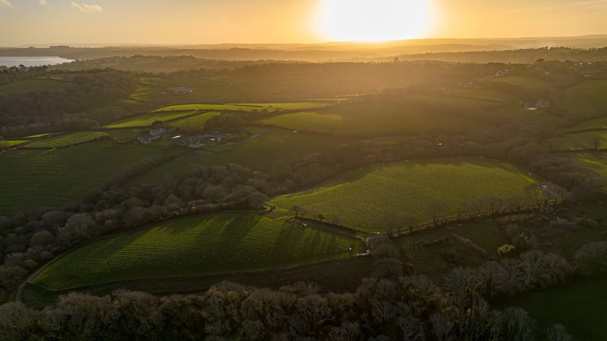
Long story short, this project quickly became something very special. Built from the ground up, it covered everything from logo design and business cards to photography captured through the seasons and a fully stacked website. By working hand in hand, we shaped a brand that truly stands apart in an otherwise ordinary market.
The brand.
Inspired by Cornwall itself, the movement of the sea and the natural contours of the vineyard. The logo/brand captures a sense of place while signalling a fresh start for a family-run vineyard looking to break the mould of the current market. We worked closely throughout the entire process, from initial sketches on paper through to refining concepts, selecting the colour palette, and shaping the final form. I am particularly proud of this project because it’s a great example of all the things
MAD Works can offer. Use the link below to see their amazing website.

The main event.
Once the brand for The Cornish Vineyard was in place, the website became about bringing that identity to life in a more immersive way.
The process was led in a similar way to creating the branding. We worked hand it hand to shape a calm, Cornish and story-driven experience that reflects the pace and personality of the vineyard itself. Custom layouts, considered content, and carefully balanced imagery all work together to create a proper Cornish Vineyard experience. Click below to see for yourself.
The pretty bits.